Wednesday, March 6, 2013

Field Navigation Map

Introduction: The purpose of this exercise was to create a Field Navigation Map that will be used next week when we take actual measurements at the location. We will then use the map to plot points given to us by Dr. Hupy that we will have to manually polot on the map. To prepare for the field work we needed both a useable map, that would be easy to read, as well as a way to measure distance. The following outlines what was done to prepare for our field work.

Method: The first step in our creation of a Field Navigation Map was not a reference map, but actually a crude method of measurement. To come up with this method each student walked 100 meters 4 times and recorded their pace count. Then, from each group, the person with the most consistent pace count won the job of measuring the distances. My pace counts came up 69x3 and 68.
We then went inside to start making a reference map that we could bring out into the field with us.


The first thing was to add the aerial map to ArcMAP. By adding this basemap first we are able to add any additional layers and they will 'project on the fly' to the appropriate projection. The area of interest(AOI) is the Priory in Eau Claire, WI.
Here is the aerial picture with the boundaries and grid already added to the area of interest(AOI).
 
Zoomed in view of the AOI with boundaries added

After adding the basemap and boundaries the next step was to make two maps. One map was to be just a reference map that you could refer to when out in the field. Purpose of the reference map is mostly to be able to get a bearing of your location by landmarks, tree lines, etc. Along with general landmarks we also wanted some general topology and a grid system for further reference.
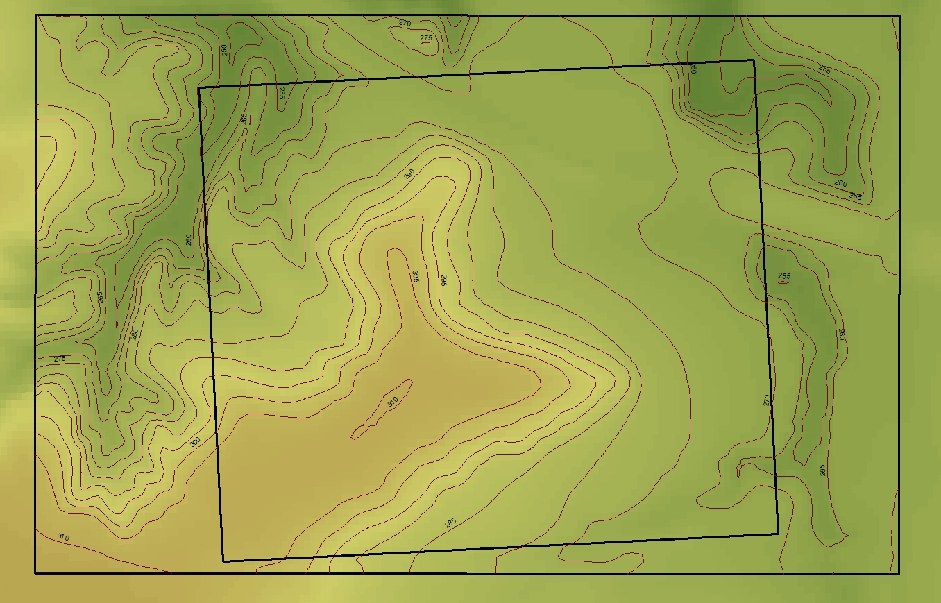
AOI with 5 foot contour lines

Grid overlay

With the basics of a basemap, boundaries, contour and grid overlay I was able to make a basic reference map and a basic topological map.
The idea behind a basic topologcial map is just to give a general idea of topology as well as being able to use it for marking points and any notes you may have. Our group actually decided to use another map with no color background to further simplify it.
Above is a basic map with the 2 foot contour. It is clearly more dramatic looking when it comes to the peaks and valleys that is at the AOI.

Discussion: This was just the first part before actually going out into the field and doing some navigation and work. As in all other exercises in this class, the repeated theme is to be prepared before going out to do your field work. This exercise was no exception. It was important to have a workable base map with usable data on it like the grid and contour as well as having a somewhat accurate way to measure distance.

Conclusion: I think this was a good start prior to doing the actual field work. It also gave me some more experience with dealing with map projections.

Sunday, February 24, 2013

Distance Azimuth Survey

Introduction: This weeks exercise was to conduct a Distance Azimuth Survey. The first thing we did was to go through a practice run with at least two different survey tools. We used two different types of laser devices. The first device was a distance finder, which required our partner to stand at the different locations with a receiver, and the other shot the distances from the origin. The other device was a distance and azimuth finder. This worked just by shooting the selected points from the origin.
Laser Technology TruPulse 360 is the tool we used to find are distance and azimuth readings.


Method: The idea in this project is to take a distance reading and azimuth reading from a point of origin(s) to various points in the field. These points can be trees, posts, signs, etc. Distance readings are straight forward, but Azimuth readings need a little clarifying. Azimuth is an angular measurement in a spherical coordinate system. Azimuth readings rely on north to be 0 degrees or 360 degrees. But, true north will differ from magnetic north. True north refers to the direction of the North Pole, while Magnetic north refers to where a compass will indicate north is. So, in the majority of areas in the world you will have to adjust to make up the difference between true and magnetic north. Fortunetly for us, Eau Claire, WI almost lies directly on the 0 degree difference(between true and magnetic north) line. See below.
World Magnetic Declination Map

Since we didn't have to worry about the magnetic declination, the first thing that needed to be done was to pick a point that we could find on an aerial map. That way we could find the XY coordinates from Arc Map. For the practice run, the whole class went outside and took practice shots with at least two different devices from the same tree. Everybody was also required to shoot some locations.  Below is the survey of our trial run.

Our first survey.
Our origin was a large tree where all of the lines originate from. For the most part everything worked out as expected, except for three points. Points 9, 11 and 13 are pointing in the wrong direction. The distance seems to be accurate, but the azimuth is wrong. I added 3 red points to indicate where points 9, 11 and 13 should actually be. We hypothesized that when I was shooting, I changed my position at the origin. But, this does not make sense to me, because the azimuth readings should be the same no matter if I was on the left or right side of the tree. The only problem there would be very little of degree discrepancy. Anyway, we felt we were ready to move on to the main project.

Main Project: My project partner(Tonya) and I decided on the Beehive area on campus for a number of reasons. First, it was out of the wind and it was 10 degrees the day we shot our points. Second, it was about the perfect size for a 1/4 hectare with plenty of points. Besides choosing the area, the first thing was to find a origin to begin shooting some points. We found a fairly large Maple tree on the NE corner of the area. First, it was free of brush for the most part, second we figured we could find it on a aerial map(to confirm XY coordinates). Once we found the origin Maple tree we decided to find a second origin point that we could take further readings from. There was a large Pine tree about 50 meters from the Maple tree that we decided would work well due to the fact we could find it on an aerial map. From there we choose a third origin spot on the corner of the garage. See photo below to see the three origins in red.
From each origin we proceeded to take readings of various objects, trees, beehives and fence posts. In all we took about 55 readings in case some of the points went astray like in our practice run. Below is a list of the points with XY origins, Azimuth and Distance reading as well as any notes on that particular point.
 
 
Example of our data. 
Once the data was collected we imported it into ArcGIS. Then we ran the Bearing Distance to Line command under the Data Management/Features in the Arc Toolbox. This was the result:
Bearing Distance to Line Image
 

We then ran the Feature Vertices to Points command to convert the data to points.

 
Finally we added a base map.
Discussion: For the most part we were pretty happy with our data. As seen above our shots from our first origin, in the upper right hand corner, did not match up with origin 2(lowest origin point). We were not sure exactly what went wrong with the data. One idea was that the coordinates of origin 1 were off, but all the other points are ok except the points that point south towards origin 2. Another idea was that there may be another large pine tree that we missed and confused the two. This required another trip out into the field to confirm there was not a mix up of origin points. As it turns out there was only one large pine tree, so it seems to confirm the data was off. I do believe this data discrepency may have been caused by shooting the points from different sides of the tree at origin 1.

Conclusion: This was a good exercise to point out the need for multiple data sources for conducting a survey. It would have helped to used two different survey tools just to make sure out data was ok. We also ran into a battery issue, not only with the Distance/Azimuth finder, but also our digital camera. More time would have been nice to be able to go back out into the field to resurvey some points as well as implement some ideas that we came up with after our first attempt. .

Sunday, February 17, 2013

Balloon Mapping I

Introduction: For Activity #3 we began constructing  two different types of balloon mapping methods. The first one will be done with a digital camera attached to a balloon filled with helium that will be held to earth with a long string. The second one will be free to float into the atmosphere as far as it can reach until the reduced air pressure will allow the balloon to expand and eventually explode. This is also known as HABL(High Altitude Balloon Launch). Thus plummeting back to earth where we will search for it by means of a GPS tracking device that will be aboard our makeshift space capsule. But, the main point of this initial exercise is to come up with the basis of operation and implementation as to have a successful balloon launch, but also to limit unexpected errors by proper preparation.

Method: One of the first items that needed to be addressed is the weight of each individual piece of hardware. 

Weights of all hardware that may be needed for the balloon launches.
Balloon Mapping
In the Balloon Mapping project we will be launching a balloon filled with helium up to take photos of an AOI(Area Of Interest). In this project the balloon will be attached to a string, so this will be for a smaller AOI then the HABL. List of hardware needed for this project.
5.5' Chloroprene balloon
1000m of string
Various zip ties and rubber bands
Digital Camera(light and small, continuous mode ability)
Covering for the camera(2 liter soda bottle cut in half)
Snap Swivels
1.25" steel ring
Helium


Sample of balloon mapping. From top to bottom: Balloon, camera, string and finally a human.


Design 1 of a covering for the camera.
Design 2, the Hindenburg
First, build the camera enclosure: Here are a couple of examples of enclosures for the camera. Notice that both examples have 'wings' to help stabilize them in the wind.  Design 1 is taken from an actual balloon mapping kit, Design 2 is more of an original idea by a couple students. My opinion is the first design looks like it would be more stable and mounting the camera would be easier.


Second, figure out a way to attach camera into enclosure.  In the picture below, student tied a string into a loop and wrapped the string around both sides of the camera. Not seen, but the student is holding the camera up by the two loops above the camera. These loops that are being held by the student will then be slipped through the top of the enclosure(Design 1) and attached to the balloon string.


Third, getting the 'take picture' button on the camera to be compressed while the camera and balloon are airborne. As seen above there is an orange rubber band holding a small piece of eraser down to ensure that the 'take picture' button is held down continuously. Again, the camera must be in continuous picture mode when sent up.

HABL-High Altitude Balloon Mapping
The second part of the project is to send a balloon into the shallow atmosphere with a camera recording the land as it ascends. The idea of this project is essentially the same as balloon mapping except there will be no string to hold onto to keep the balloon earthbound and there will be severe cold to deal with as well. Below is a simple graph of Temperature vs Altitude.

To help combat the effects of the sub-freezing temperatures the camera will be mounted in a stryofoam minnow bucket surrounded by heat pads.


The idea is the place the camera into the bottom of the minnow bucket so as the bucket ascends into the air the camera films the shrinking landscape. In the picture below a hole has been cut to allow the camera to take pictures through the bottom of the bucket. The camera will then be covered by heat pads then covered by a piece of styrofoam insulation. See bottom picture.
 
As the balloon reaches high altitudes the pressure will become lower. So low in fact that the pressure inside the balloon will cause the balloon to expand and eventually pop, causing it to descend back to earth. So, that is where the parachute comes into play. As the minnow bucket descends the parachute will deploy and keep the bucket from crashing back to earth.

Discussion: The designs for the Balloon Mapping were pretty straight forward due to some information readily available on the web and with the balloon kit that was brought to class. I think the biggest challenge will be with the HABL. Keeping below the recommended payload weight of 2 pounds and keeping the camera not only secure, but warm. Some of my concerns would be not only the camera getting cold, but condensation on the lens. Sealing the camera enclosure in may be an option.

Conclusion: There were a lot of different things going on as for testing and experimenting. We've got the concrete stuff down like weights and a solid idea of what we want to do and how. There is fine tuning needed to be done when it comes to attaching enclosures to the balloon and keeping the camera warm for the HABL. Overall a lot of foot work got done on our first day on this project, now it will be finalizing our designs and then some practice runs.

Tuesday, February 12, 2013

Exercise 2

Introduction: In this weeks exercise we updated our original data as well as resurveyed and came up with a new dataset. We then entered our data into ArcGIS and ArcScene to produce a raster image and a 3D image.  
Image 1:Original Dataset in XY graph form
Image 2:Updated Dataset in XYZ table form

 
Methodology: In the Image 1:Original Data image you can see we had a simple graph format of our XY coordinates. We modified the data to a table format that can be seen in the Image 2:Updated Dataset image. This new data contains the original Z coordinates(labeled under Z) and it also includes the new resurveyed data points under Z2. We then uploaded both datasets into ArcMAP, created a feature class out of our data points and then produced a raster image.
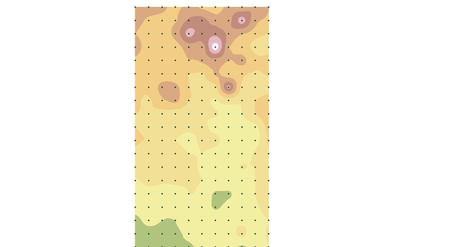
Image 3:Original data, Kriging raster image with
 data collection points laid over image.
Image 4:Updated data Kriging, raster image with
 data collection points laid over image.


We used several different types of raster images including IDW, Kriging, Natural Neighbor, TIN and Spline. In images 3 and 4 you can see the data points overlaid on a Kriging raster image. Image 3 was produced using the original dataset, while Image 4 was produced using the updated data set. Both images 3 and 4 used the same symbology color scheme. Notice how Image 4 makes more sense from a topographic perspective. The higher elevation areas are depicted in red/white while the lower elevation areas are in green/yellow. Image 3 is more difficult to depict what is happening topographically speaking.
Below is a comparison of the rest of the raster images we produced.

Image 5:IDW
Image 6:IDW2


Image 7: Spline
Image 8:Spline2
Image 9: Natural Neighbor
Image 10: Natural Neighbor2


All of the images on the left are from the original data, while all of the images on the right are from the updated data. No matter the method of producing the raster image, the updated data produces a nicer and smoother image.
Next we loaded the raster images into ArcScene. It was decided that Kriging and Spline were the best images when it came to 3D.
After adding a color scheme and adjusting the labeling intervals, the 3D images are below. Kriging on the left and Spline is on the right.


Discussion: From the images above it was obviously beneficial to go back out to our sandbox terrain and remeasure and improve our data. The images produced from the second dataset have a much more fluid look to them and the grid points are not so visible as in Image 5. Though I can't say any of the 3D images came out perfect for what our actual terrain was like in the sand box, I feel the Kriging image(s) turned out the best. The mountains have a very dramatic peak to them, which I would say is the negative aspect of these images. Otherwise the terrain turned out satisfactory. The areas of lower elevation have a pretty smooth look to them and Zach's mesa is visible in the upper left hand corner.

Conclusion: As in any data collection task, this exercise was the rewarding part due to the fact we were able to see our dataset come to life. In order to achieve the rewarding part of this exercise we had to make sure our data was not only collected accurately, but entered into ArcMAP correctly so we could see the images that we hoped to see. This exercise has also furthered my knowledge and confidence with ArcMAP, introduced me to ArcSCENE and introduced me to entering my activities into a blog. Though I'm taking this course to further my knowledge in GIS, I'm happy that I'm getting more practice processing and then recording my activities. Something that is very important in any job that I get after college. 

Sunday, February 3, 2013

Digital Elevation Surface

Zach doing some landscaping
Goal: Create a Digital Elevation Surface with a couple yardsticks, paper and a pencil. 
The first thing we did to create our Digital Elevation Surface was to custom make the topography with snow that was in our 'sandbox' as well as added some for our mountain. We created valleys, plains, mountains, cliffs and a plateau.
We then placed a yard stick across the sandbox as a make shift sea level indicator to measure our Z-coordinates. On top of the yard stick was a meter stick so we could measure our elevation every 10 cm along the XY axes. This stick started at the bottom of our make shift grid and moved up the Y axis every 10 cm. This was are way of making our own little Cartesian Coordinate System. For every 10 cm on the Y axis, we then recorded data every 10 cm across the X axis.
Zach moving the yard stick 10 centimeters North


Zack measuring Z-Coordinates while Joe recorded data
Our Data
For the most part I think we had the right idea in how to obtain, collect and record the data. With the limited amount of tools and time, we made a accurate yet crude elevation model. I do feel we probably should have collected data at every 5 cm(or more) instead of 10 cm. When this data is added ArcGIS, the dramatic inclines and declines that were part of the landscape will probably not show up. I guess they'll show up, but a lot can happen in 10 cm on a 100 cm X 200 cm landscape. That being said, this exercise is obviously an introduction to a bigger idea and practice. Things that I would do differently would be measurements every 5 cm and more pictures from different angles of the landscape.