Introduction: In this weeks exercise we updated our original data as well as resurveyed and came up with a new dataset. We then entered our data into ArcGIS and ArcScene to produce a raster image and a 3D image.
 |
| Image 1:Original Dataset in XY graph form |
 |
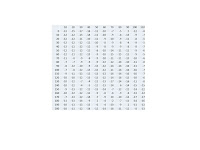
| Image 2:Updated Dataset in XYZ table form |
Methodology: In the Image 1:Original Data image you can see we had a simple graph format of our XY coordinates. We modified the data to a table format that can be seen in the Image 2:Updated Dataset image. This new data contains the original Z coordinates(labeled under Z) and it also includes the new resurveyed data points under Z2. We then uploaded both datasets into ArcMAP, created a feature class out of our data points and then produced a raster image.
 |
| Image 3:Original data, Kriging raster image with data collection points laid over image. |
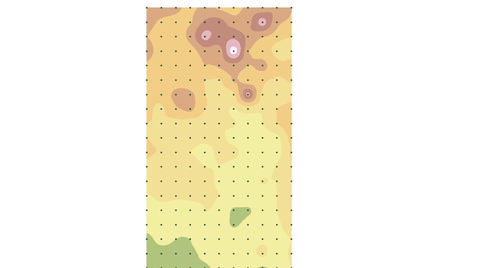 |
| Image 4:Updated data Kriging, raster image with data collection points laid over image. |
We used several different types of raster images including IDW, Kriging, Natural Neighbor, TIN and Spline. In images 3 and 4 you can see the data points overlaid on a Kriging raster image. Image 3 was produced using the original dataset, while Image 4 was produced using the updated data set. Both images 3 and 4 used the same symbology color scheme. Notice how Image 4 makes more sense from a topographic perspective. The higher elevation areas are depicted in red/white while the lower elevation areas are in green/yellow. Image 3 is more difficult to depict what is happening topographically speaking.
Below is a comparison of the rest of the raster images we produced.
 |
| Image 5:IDW |
 |
| Image 6:IDW2 |
 |
| Image 7: Spline |
 |
| Image 8:Spline2 |
 |
| Image 9: Natural Neighbor |
 |
| Image 10: Natural Neighbor2 |
All of the images on the left are from the original data, while all of the images on the right are from the updated data. No matter the method of producing the raster image, the updated data produces a nicer and smoother image.
Next we loaded the raster images into ArcScene. It was decided that Kriging and Spline were the best images when it came to 3D.
After adding a color scheme and adjusting the labeling intervals, the 3D images are below. Kriging on the left and Spline is on the right.
After adding a color scheme and adjusting the labeling intervals, the 3D images are below. Kriging on the left and Spline is on the right.


Discussion: From the images above it was obviously beneficial to go back out to our sandbox terrain and remeasure and improve our data. The images produced from the second dataset have a much more fluid look to them and the grid points are not so visible as in Image 5. Though I can't say any of the 3D images came out perfect for what our actual terrain was like in the sand box, I feel the Kriging image(s) turned out the best. The mountains have a very dramatic peak to them, which I would say is the negative aspect of these images. Otherwise the terrain turned out satisfactory. The areas of lower elevation have a pretty smooth look to them and Zach's mesa is visible in the upper left hand corner.
Conclusion: As in any data collection task, this exercise was the rewarding part due to the fact we were able to see our dataset come to life. In order to achieve the rewarding part of this exercise we had to make sure our data was not only collected accurately, but entered into ArcMAP correctly so we could see the images that we hoped to see. This exercise has also furthered my knowledge and confidence with ArcMAP, introduced me to ArcSCENE and introduced me to entering my activities into a blog. Though I'm taking this course to further my knowledge in GIS, I'm happy that I'm getting more practice processing and then recording my activities. Something that is very important in any job that I get after college.
Conclusion: As in any data collection task, this exercise was the rewarding part due to the fact we were able to see our dataset come to life. In order to achieve the rewarding part of this exercise we had to make sure our data was not only collected accurately, but entered into ArcMAP correctly so we could see the images that we hoped to see. This exercise has also furthered my knowledge and confidence with ArcMAP, introduced me to ArcSCENE and introduced me to entering my activities into a blog. Though I'm taking this course to further my knowledge in GIS, I'm happy that I'm getting more practice processing and then recording my activities. Something that is very important in any job that I get after college.
No comments:
Post a Comment